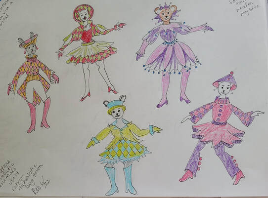
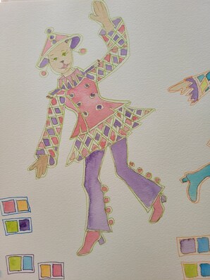
Continuing from the original idea of miniature acrobats, I love the harlequin pattern on one of them, so decided to expand upon it. Then I decided to try outlining in white, though these are not outlined, just given a space between painted areas. 
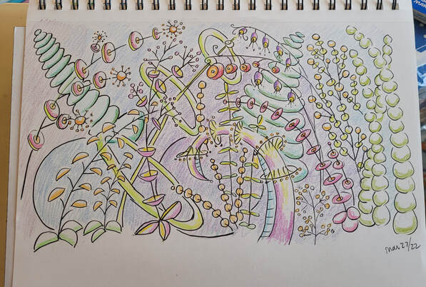
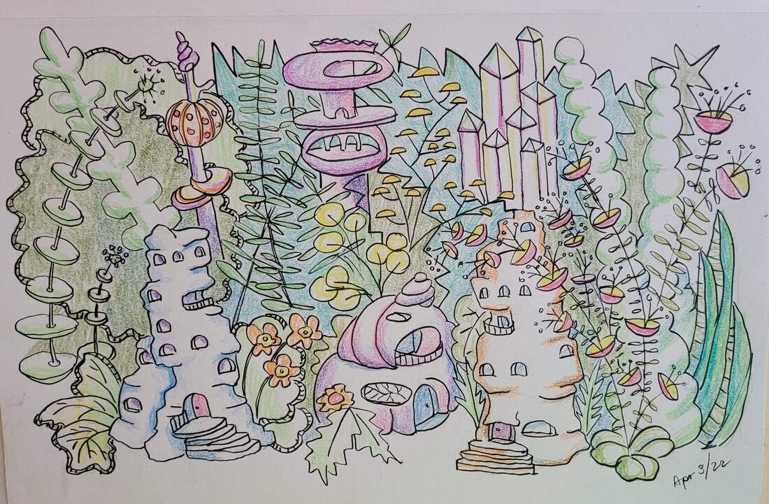
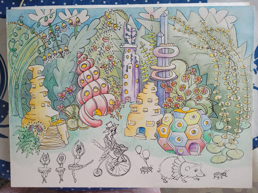
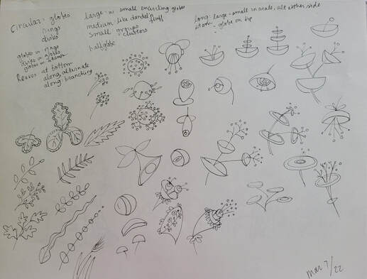
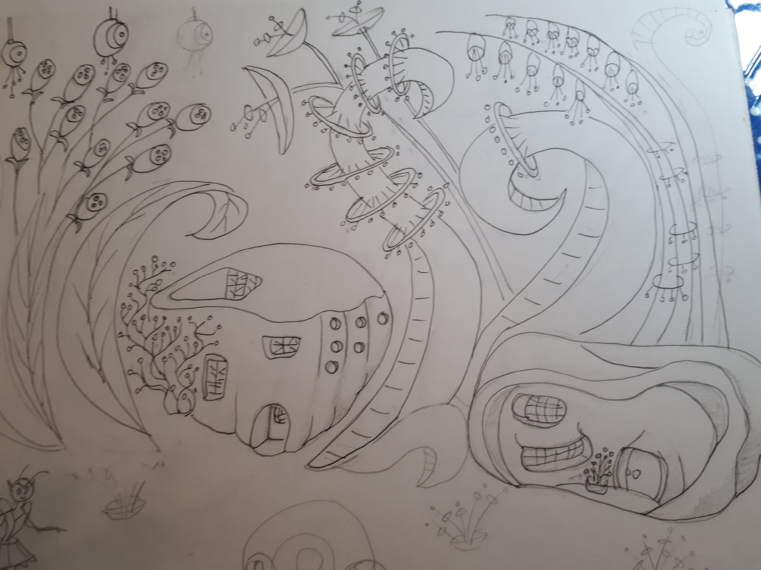
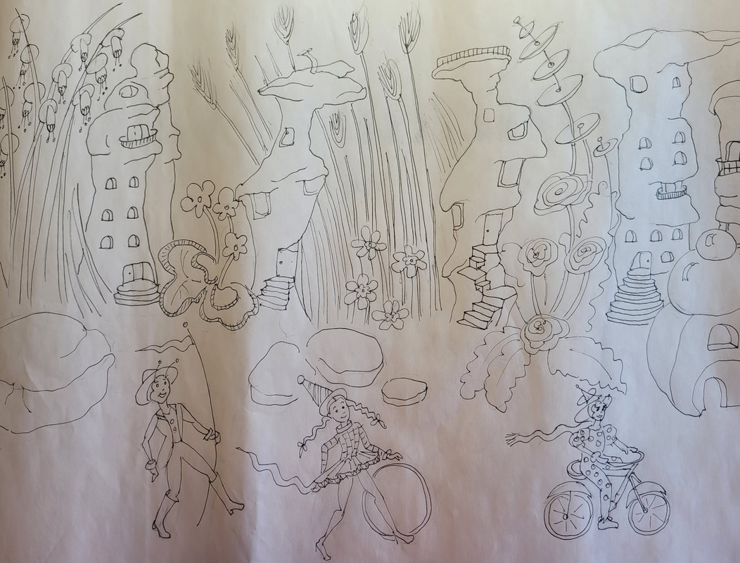
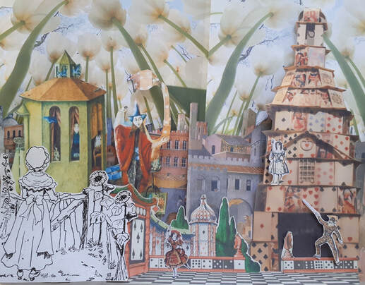
Further back into Spring, you can see that I had continued to explore micro worlds, as I had thought of my miniature acrobats strolling or parading through this world, and not my original idea of cartoon insects. This is the first colour version, in pencil crayon. I used the inspiration from the wind and rain swept earth forms, shells, and crystals. 
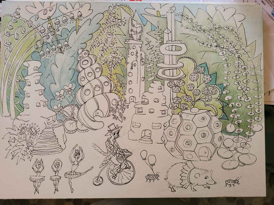
I started my first watercolour of combining both ideas as you can see from the character on the Penny-farthing bike: he's a miniature acrobat, and with the insect ballerinas, Ladybug balloon carriers, and a hedgehog for fun! Unfortunately, I did not like how the characters turned out in my sketch due to the rougher texture of the watercolour paper and mistakes made in the drawing execution. I hoped to scan this image and remove the characters. 
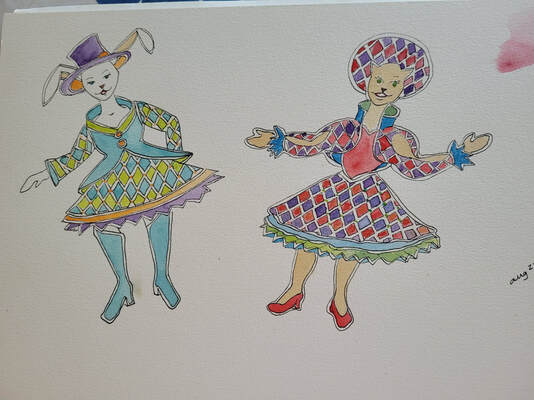
Then, while getting a new black pen, I saw coloured pens and thought I'd try outlining in different colours!! I love them, but the outline is too fine. Then I tried a new character, and outlined her in black and only her clothes in coloured line. 
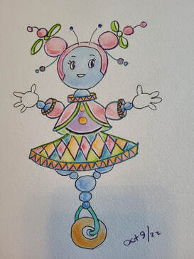
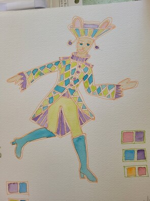
I wanted to have characters that were not seemingly only Caucasian, and thought of a bionic robot type of character and the ability to colour them all the rainbow and Bipoc colours as well! I still love the harlequin pattern! I tried to add white outline, but it wasn't as successful with the medium I used - onward with the journey of discovery!!
0 Comments
One more collage and then back to miniature world! I printed an image of a cubic mineral, at about 30% intensity, and then drew with a fineline marker to create an illustration. The right one is a cutout of a print, of an opalescent shell, and a print of a bubble on top, to create a building. I was inspired by the Jetson's cartoon, with their lights and space-age forms, to create new forms for flowers. I am still working on my idea for a miniature world, of fantastic plant and homes, inspired by streamlined nature and space-age forms. At this point, I was interested in bug-cartoon characters. Then I found beautiful water and windswept earth forms. I invented some forms using shells and sea urchin shapes. Instead of the bug-cartoon characters, I re-discovered my "miniature acrobats" and I think they are the perfect companions to animate this kooky world!! I plan to transfer this image to watercolour paper and paint this illustration.
I found a book on making miniature shadow box scenes and was inspired to use these ideas for my collage instead. The author gave lots of ideas for "staging" a successful scene and gave me insight into creating more dynamic collages using her suggestions. I started with just the printed images I had on hand, to create a "room" with an angle to create some dynamics. The next one I planned more, starting with a sketch of an idea. Then I searched for images among what I had in my files as well as new images that I printed, to collage with. Haha!! I love the cat! He was an unexpected character along with the fish! Also the "rug" at the chair began to dissolve, as the sketch, but instead of stairs, the pool corner seemed more appropriate! The original idea of a medieval town was eliminated for the stream scene which gave rise to more water into the image. The landscape scene I had in mind for the "window" on that wall became the landscape down the "hall". I used another file image of a necklace jewel for the light source instead of the oversized tulip (which I plan to use in another scene). I do love the unexpected, and the rug going down the hall seemed to reflect the light in the landscape, which also reflected in the pool!
I continued with this original image and tried bringing in "negative space" in the form of hands and boats. I like the strips of the portraits looking at each other. I then decided to try painting the original copy, of the background in the left image, in pen/ink and watercolour. I had noticed in one of my collage images that the "grotto" image lined up with a waterfall image and decided to combine them in the watercolour. In the original collage with grotto image, the boat bed obscures the little Japanese stone lantern. Here in the watercolour, you can see the whole image juxtaposed with the bridge and waterfall image.
I have been playing with setting up a "collage" with my images collected for my "miniature theatre", but decided not gluing these images down so I can use them again, is a better idea. I posted a finished image and one of the comments was "it looks a bit unfinished". I asked myself the question "What is it that I like about this image?" I investigated further, and asked what was most meaningful in it, and what could be better. I love other artists collages, and since I was working primarily from my "miniature theatre" perspective, I decided to try working more from a "collage" perspective for a piece of art that attracted the viewer's eye to a spot, moved it across the image, repeated motifs and expanded upon what was interesting in the first try. I realized in the first image that the "sisters" faces were looking at each other, but their hands were extending in the opposite direction, so I decided to copy their hands and stretch them toward each other. I also began thinking of other famous hands and copied them for the image: The Annunciation hand of the Angel, God's hand stretching toward Adam, Eve's had holding the apple and the Arnolfini marriage hands. I love the "boat bed" and as the original had the title "Dream Sister" it held meaning as a conveyance from one aspect to the other - maybe like sub-conscious to conscious. I read a poem that included the words, and I liked the repeated motif, of the "boat bed" flowing across the image to land at the other's feet.
July 16, '20 Titled The Quest. I love this female image by Arthur Rackham. Also July 160, '20.I love this staircase, too! I'm unsure of the title, but she feels like Thumbelina, here. July 26, '20. Title: Alice on the Run. More familiar images from my collection!! Also July 26, '20. Title: Mouse's Mystery.
As I looked through my collection of projects, I came upon my little series of postcard artworks. They are collage works with collected images, words and little drawings of mine, which I posted here in March, 2017. I have my miniature theatre box set up to create my photos of a scene made of cut out paper images from my collection and artworks. However, the process had me stuck because it is quite complicated with the use of lighting, set-up and photographing it. I decided to make a paper collage instead. Then, I decided instead of pasting it down on card-stock, I'd just photograph it, so I could use the paper images again. Wow, that was a game changer!!! Now I've created about 20 images, some that are two versions - characters changed in position for another pic. I must have close to 50,000 paper images in my files, which I am now scanning and uploading to my computer (and back-up files!), as well as 30,000 collected images from my own photos and the internet. This first image was glued down, and I am not as satisfied with it as it is, but it jump started me in a new direction. It was made in February, 2019, which I published at the time. In May, 2020, I returned to the collage process, but simply took a photo of it. I then decided to print a collection of images for background, flooring, characters and objects, from which I could choose during my time of creating. The floor looks like tile, but is actually a micro-photo of stained plant cells! Title: The Dance. Here is a combination of images photographed off the tv, collected from the internet and photographed by myself, June, 2020. I do my best to collect and create images that have the same position of light source - the upper left - to maintain a continuity. Title: Lullaby. In July, 2020, with my larger collection at hand, I started making 2 or 3 collages in one sitting. This is 001-07-12-20. You can recognize the illustrated fairy, which is a costume design for ballet, from a previous collage, and the flying fairy from the previous collage. Title: Askew. This is the second one, from that day 002-07-12-20. You can see how the shadows give a bit of 3D here. Title: Longing.
While shopping for groceries in February, there were various Chinese New Year's decorations hanging up. This year was the first time that I saw a marvelous Prosperity Tree! It was an image of an orange tree and I loved the paper craft image with its 3D pieces. It thrilled and inspired me to discover more about its symbolism! I was excited to explore the symbology of the oranges, which represent golden coins because of their shape and colour. Naturally an orange tree is the perfect symbol for prosperity! There were golden coin 3D paper images at the foot of the bowl. The blue bowl in which the tree was planted, seemed like a heavenly blue to me, and at the roots of the tree in the bowl, there were jewels on the soil. Red is the colour of good luck, and little red rectangles were envelopes in which you could put paper money. In my first image, I painted a Prosperity Tree in watercolour and included a golden dragon on the blue bowl. It symbolizes that the tree of prosperity is rooted in Heaven, as you can see there are stars on the trunk of the tree. Differently than the image of the original ornamental tree, I substituted golden coins in the heavenly soil, instead of jewels, but still showing that the soil is loaded with riches. I loved the information about the Chinese dragon being a beneficent character and chose to include him as a spiritual being. Of course, the cloud holding up the bowl and its tree further symbolizes the aspect of heaven from which all bounty springs. After painting this image, I thought about how I could bring it into three dimensions, and remembered that I had bought an electrical ornamental tree whose flowers light up. I decided to collect an assortment of Chinese New Year's ornaments and decorate this tree as a Prosperity Tree! I was able to find lots of Chinese decorations, red and gold items. One decoration was in card, of different dragons. You can see in the bottom image, how I cut out various parts of the card dragons to create a more three dimensional card dragon to fit around my blue bowl. I specifically wanted this dragon because of its golden colour and the reflective metallic finishes on the print of the card. I also bought deep blue velvet to use as the "soil" at the bottom of the tree. I found an "Easter" basket at the Dollar store and weighted it with gravel, after spray painting it deep blue. I folded blue velvet as the "soil" and placed chocolate foil covered coins in this "soil" around the tree base. I can still access the off/on button at its base. I bought a gift bag that had gold foil discs printed on it, and cut them out to hang like coins on the tree. I also bought battery run light strings to layer on the tree for more sparkle! I "gold leafed" the trunk. Some of the decorations include beads like diamonds.I sprinkled gold foil stars on the velvet "soil", too. Here it is on display in my living room's Prosperity Corner! I had the classic Buddha and then found the wonderful dragon statue and the Laughing Buddha. I think they make a perfect trio under my Prosperity Tree!
I brought this 14" square box from my storage and cut out one side, to create a space as a miniature theatre. I cut foam core to create panels for the two border layers for the theatre side wings. From the top of these foam core pieces I attached a string of Christmas mini lights. I use cellophane wrapping paper to color the light that shines down into the scene. I also have "book lights" for spotlights.You can see below how I photographed it, to delete the outside of the box - it looks just like a stage! This is the first try with the printed copies of my water color images.I use copies because I can resize them from the original paintings. I will decide if they are the right scale and trim the images before my final photo of the set. I also have to adjust the lighting and deepen the color on the copies!! Below, you can see my new painted background and added fabric for the "snow" ground. I still have to adjust the lighting, but I did increase the actual color of the copies. You can see how the background is out of focus as the camera focuses on the foreground. I have cropped the sides out of the picture, as I have to make sure it is the right dimension to print for a card. I have to fiddle a bit more with color and lighting, and find a Christmas tree for them to hold up!! I guess it will be ready for cards, next Christmas!
|
Diana's Blog
Some random musings about creativity and life - philosophy, practicality, creativity, balance, and joy! Archives
October 2022
Categories
All
|